 Player Research
Hey folks,
We’re going to bombard you with yet another lengthy post today. If you haven’t read our year in retrospect or looking forward posts they’ll be on the internet forever, but we recommend you read them before the end of time. Today we’ll discuss our attempts to rebuild our User Interface and how we went about the redesign.
We Needed Help
When we opened up this thread asking for UI feedback we had a hidden motive. We were going to use the information you gave us, coupled with our own internal understanding of what the UI needed to accomplish and take it to a company called Player Research.
Player Research are a Brighton-based Games User Research and playtesting company that uses their accrued knowledge on player experience to help companies refine their existing design decisions with the goal of making the game intrinsically “more fun” for every player who sits down to play it.
The Problem
Being an Early Access title is a confusing mess for developers and fans alike. We’ve all experienced broken games, clunky UIs and the myriad other horrors that accompany playing a game during its earliest stages. We’re sure that most of you remember how our game was in its first playable state – unfortunately the only thing that hasn’t been drastically improved since we first launched is our UI.
We hastily created the UI because our game needed to be moderately playable for Eurogamer and allow users who weren’t familiar with the Dungeon Management genre to have a modicum of fun while playing our game. It was not intended to be a final solution, but merely function as a short-term stand-in until our game had more features.
Fast forward four months – we’ve cobbled new features onto our initial design and nestled varying amounts of gameplay within our shoddy UI – group management is a nightmare and our “placeholder” is beginning to show its age.
Basically – the UI we built is old. Not the venerable kind of old that marks a good wine or classic car, but the kind that smells of death and suggests a past shrouded in endless misery and incomparable pain. It has no form, new players find it difficult to use, and it’s impossible to scale as we add new features to the game – as evidenced by the recent addition of unit grouping.
With the rotting corpse of our ramshackle UI casting a dark cloud of dismay over all of us we decided to pack up our design documents coupled with your feedback and send Josh on a train headed south to Brighton
Player Research
He arrived at the Player Research dungeon on a typical English day (see: cold and miserable) and saw the bright-eyed team already sifting through our sizable novel of design notes. They sat him down in front of a whiteboard and began explaining the three goals they hoped to accomplish over our four day session:
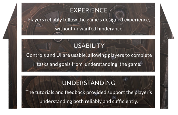
Whiteboards were quackly filled as these three key points were tackled in order. An initial conclusion we came to was that creating a Dungeon Management Game has its downsides — there are very few recent examples of a game that has these particular kinds of controls, mechanics, and features.
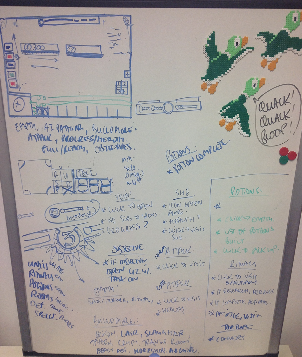 Ducks are essential to the creative process; never trust the dastardly, wingéd beasts without a deployed umbrella in hand.
By the end of the first day they’d tackled a good portion of the problems we faced and had come up with an ingenious improvement to room building that would show markers where props would spawn. This elegant change would make it immediately clear if your room would be functional and we liked the idea so much that we’ve already built it into the game and should have it included in this week’s patch.
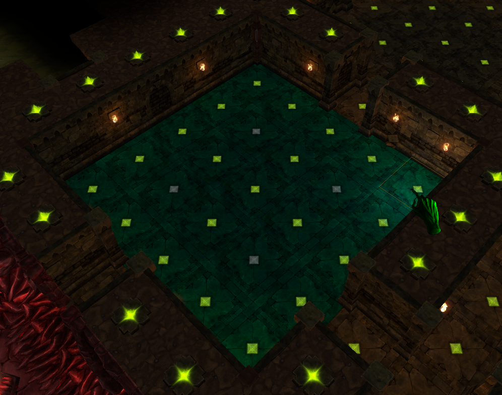 Current implementation shows coloured gems where props spawn, in the future we expect a ghostly outline of the room to appear.
After two days of furious, multicoloured scribbling across various whiteboards we departed their office for the final time – a single tear slid down the cheek of everyone involved as we silently mourned the death of our placeholder UI.
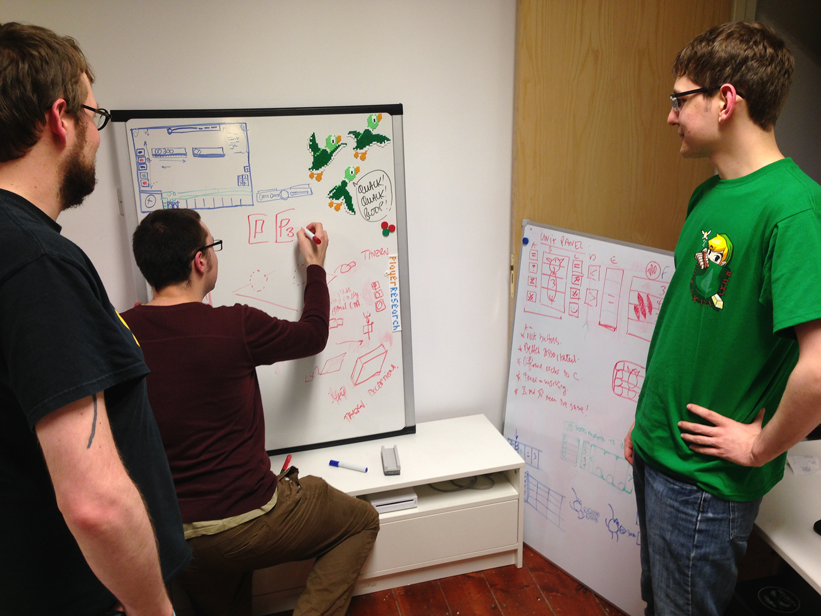 It may not be apparent, but everyone pictured is in mourning. Tears have been photoshopped out.
Once left to their own devices the Player Research team submerged themselves in two days worth of notes and discussion to create our final report. Two days later they sent us a 42 page document that consolidated the two days of discussion in addition to a list of solutions and suggestions to improve our player’s experience.
The report also detailed explanations of how to streamline and implement each of the systems that will eventually be present in the final iteration of the War for the Overworld UI.
What We Learned
We went in expecting a few mockups that would help us create the best possible experience for our players, but the gentlemen at Player Research would deliver a whole lot more.
The good news was that we had a few things right, which is always reassuring, but the main problem we were having is that we couldn’t view the game with fresh eyes – problems that seemed minor to us were swiftly tackled and solved. The report outlined a plethora of changes and tweaks that would improve the usability and accessibility of our game, all of which would contribute toward a better experience for our players.
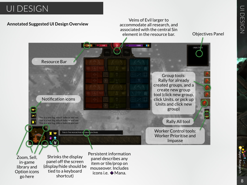 This is a mockup created by Player Research that is in no way representative of final art, assets, or design.
What we learned doesn’t just improve the game in the short run. By taking the time to get professional help crafting our game’s experience we set ourselves up for a final release that is accessible to players who are not familiar with the Dungeon Management genre – allowing them to quickly learn the unfamiliar controls and immediately begin enjoying the game.
We’d love to hear your feedback on this initial mockup, feel free to leave your suggestions, comments and feedback below this update!
That’s it for this week, we’ll see you in a few days when we launch our 0.3.2 patch!
Until next time Underlord,
– WFTO Team


I’m missing the good old creatures panel ! Being able to have an overall view of all of them, follow their growth and occupations, and, most of all : take the best of ’em in hand and throw them at the ennemy as suicide bombers (except they hopefully won’t explode !), see the fight begin, and MUAHAHAHAHA !
Concerning the room panel, it would be great being able to set our camera on an (eventually) already built room by right clicking on it !
Love the UI changes. Tow things I don’t like on the pic is the objectives window and I think the bottom menu should all have the same height as the map, or be designed in a more unified way. My suggestion is to have a button that can minimize the objectives panel, because I don’t want to see the objective when I know what to do, but want to do it on my own way.
Agrees with Aeldorns both comments. Both ideas are taken from Dungeonkeeper 1 & 2 i belive.
In DK1 you could center on a room by right clicking on the icon in the construction panel.
I also miss the old DK creature panel. Especialy being able to pick up creatures that way.
Creature panel definitely, right to roo, feature, better zoom options in and out some times it easier to play zoomed out from birds eye veiw
I admire the fact you share so much with us. It is so genuine and one should appreciate the way you are so devoted and committed to coming up with a good product. Am very sure this game will be a blast, it already looks great. No rush, do it right and take your time…we will support you all the way…you don’t see developers such as yourselves ( who actually care ) everyday…hats off to you.
Right click room icon to view and locate your prebuilt rooms
The shrink button shouldnt be with the minions, rooms, spells. I think you should push it all the way to the right side of the panel and up (right of the persistent information).
Haha, we’ve had a ton of internal debate about “The Sixth Button”
If we can find a better button to go there we may end up following this suggestion!
I like the post identifier for room layout idea.
I also agree with other comments that a ceature panel is a must. It would also be useful to have a right-click zoom to creature/room from the panels.
Having the flashing battle icon (as in DK2) to zoom to site was also a very good feature that should be emulated.
I presume that the objectives panel would be an expandable panel seperate fromthe main UI, as it would be useful to access it, but have it hidden for the majority of the time.
For the love of this game PLEASE allow the game to plyable with only a mouse or combo of mouse and keyboard. Also PLEASE PLEASE PLEASE let the middle mouse (or assignable button) allow for rotating the dungeon!!!
The game will not be playable with only a mouse and keyboard. You’ll need a computer, monitor and speakers as well. 😉
I miss all of the UI elements of the original Dungeon Keeper, especially the panels.
New interface looks fantastic, the main issue I’m having is the buttons are just a tad too small for building, traps and spells. Finally if you could add keybinds that would be fantastic too. Many thanks for rebooting the genre!
As so many othersI also miss the creature panels and am very pleased to hear that you guys are working on it.
Also I would like to tell you guys that you made m very happy with this project. I lover Dungeon Keeper always didd and missed it terribly so you guys are my heroes and I can’t wait for this project to be finished but in the mean time i wil just play the beta.
Keep up the good work guys
Hey guys,
first of all thank you so much for war for the overworld!!!!
I always loved dungeon keeper and I already gave up waiting for games that are as good as the original. So thank you guys for bringing back good old days 🙂
However (dunno if it has been mentioned) it’s a bit annoying when you click the room/spell panel the shovel-curser keeps activated, so you accidently dig or grab something at the same time.
Keep up the good work! I’m looking forward to play a great game!
This happens only when you play fullscreen without choosing the best/native monitor resolution, see: https://forum.subterraneangames.com/threads/383-in-fullscreen-with-lower-than-best-resolution-clicks-on-ui-trigger-actions-behind.4785/
Great stuff! This game is filled with potential and i’m allready enjoying the dungeonbuilding/fighting! It can only get better and the team seems to have plenty of ideas for this game!
As already mentionend we need a creature panel, like the one in DK2, where you can sort in mood, working, fighting…
A objective panel that can be hidden and resized will be nice also.
Maybe a slider in options to adjust the ui size and keybindings to panels/ui functions.
Just something which popped into my mind. Not completely sure if it is UI, but kinda… being able to turn on voice actived spell casting. 🙂 I can’t stop myself when playing the bullfrog game, I always mimic the spellchant.
I know this might be weird to think, but I think that it would be nice if you could, for convenience’s sake, replace that rally bar with a spell bar, and bring the rally bar to the bottom right of the screen (beside the tool bar). I feel that spells are the kind of thing you need immediately or not at all in some cases, and not having to go into a particular panel to cast will help competitive play allot.
Also, as everyone else has stressed, the creatures panel is defiantly part of the experience and was my go to bar in DK and DK2. In my opinion it might be the most important tool for those games.
Hey Guys
looking at the picture above of creating a room just reminded me of somethuing. Just a little something thats been quite annoying for me everytime i play the game. not UI related, but those green markers indicating your claimed territory : they seem extremely bright to me when i play (to a point where it almost looks out of place compared to the rest of the games visuals).
Maybe if it was changed to the original games red marker, or even an option to choose your own color would be awesome.
Just my 5cents worth
Thanks again for creating war for the overworld.
Hi, love the overall feel of the game so far. I’m playing on the linux version, and have noticed a few things. Windowed mode seems to run for a few seconds, then shuts off. Also, on the sandbox, Nothing showed up on the rooms and defences panel.
heeeey. it’s those cute little ducklings from duckhunt!!! 😀
Another worthy addition would be the notifications bar above the ui (it looks like there’s a spot that would work perfect already) similar to dungeon keeper 2. It was nice to be able to instantly zoom on the unhappy creature, magical item or creature entering your dungeon. I know there’s the auditory notifications,but some may be difficult to hear or it would make the game more playable without sound. It would really add to the intuitive, polished feel of the game
There are notification icons to the left just above the main UI bar. I guess they’d appear by dropping down as in DK1
i think that there should be some kind of spell or tool allowing imps to build unreinforced walls if player dig wrong tanel or shape of room and wants to change dungeon shape… what do you think
of course to prevent improper use of that tool i PVP it could have X time to build or can not be use in combat
i like this idea, being able to build back the rock would be a great addition.
I agree with Aeldorn, It would be great to have creature panel again and be able to easily set groups of minions.
Hovering the cursor over specific group rally buttons should display members of the associated group. Just a thought. 🙂
Good Point! 🙂
I just started playing and need helpI have tried to finish the 5 maps provided and am stuck the first one was cool reminded me of old times but I think it was the 3rd and 4th what do you do I have killed and or built everything and the game never seems to end how do I figure out what my objectives are??? and is there only the 5 mini maps am I missing something please help as I am getting frustrated at this point
If you creat a room tile you did not what can you change it back. Can you tap it again so that your minons can change into empty tile space. Then you would be able to develope it into a room tile of your liking.
you mean sell the room you built? there is a little $ button right by the mini map for selling rooms
I just wanted to say that I am deeply impressed with the amount of care you guys are putting into this game. Honestly, reading a few of these Wednesday posts was what convinced me to invest in your game. I know you guys will release a real dungeon management game that knocks my socks off and uses them to slap some minions silly while chuckling evilly.
Keep up the good work!
<3
Hi,
i think its great, that you are involving us so much in the creation of this game. I have a few suggestions concerning the UI:
-because the main UI is in the bottom left, i feel that the bottom right corner of the screen is a kind of “lost space”. So why not put the objectives panel on the bottom right and the group tools next to it, as a permanent tool box. This would limit the UI to the bottom and the upper part of the screen and make the screen look tidier. You could make the objectives panel as big as the the minimap, which would add symmetry to it.
-once you add keyboard shortcuts, it would be nice to have an option that puts the key bindings on a corner of the pictures, to learn the bindings more easily. some games show the key bindings when you press “Alt”.
Thanks for all your hard work, I cant wait to see the finished game, its gonna be awesome
I like the red above all can you make that a choice?