 UI Updates, Unit Shields & More
Hey folks,
We have just over a month left until the release! With such a short period of time left we’re knuckling down and focusing on the last few components of the game. As always everything you see here is WIP and does not necessarily represent final content.
Patch 0.7.0 will be our final major patch before 1.0.0 and we’ll be pouring over every aspect of the game with our eyes set on polishing it all up for you. Over the next few wednesdays we’ll be talking about the areas we’re working on, the blanks that still need to be filled in and more. This week we’re going to be taking a look at the final UI pass and what you can expect in February’s patch.
UI Layout and Design Update
Pragmatically minded Underlords will appreciate the need for a solid and cohesive UI that will permit them the greatest levels of control over their fiendish minions and ever-expanding dungeons. To this end we sent a scouting party up to the surface to acquire an expert UI developer to implement the final form of our interface, he’s currently working hard under the watchful eyes of our Augres.
Based on the feedback we’ve received on the current iteration of the UI we’ll be tweaking the layout of the UI ever so slightly. Firstly we’ve moved the rituals tab to join it’s kin on the bottom bar, meaning that all the important actions you can take regarding dungeon control are now in the bottom portion of the screen.
The top bar still contains all the pertinent information regarding the status of your dungeon, the only major change here is that the mana bar is always the same length, showing how much of it is yet to be unlocked via sins. We’ll also be adding tooltips to the top bar with information on pay day, ritual progress, and locked mana.
Keen-eyed Underlords will notice that the UI has also undergone a significant reskin, the warm and familiar brickwork has now been replaced with a simpler more muted stone. The aim of this change is to make the screen a little less busy, to draw the eye less while still conveying the important information.
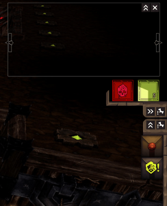
Finally we’ll be adding a notification panel onto the right hand side of the screen, next to the objectives. This panel will keep you informed of all the happenings occurring within your Dungeon.
Unit Shields
Our original Unit shields have now been in the game since 0.2.0 and they’re really showing their age. Fortunately we’ll be completely replacing these ancient artefacts with brand new, versatile and comprehensible shields.
Not only will the new shields will be able to convey much more information to you more intelligibly, they’ll also no longer have an ugly black border around them, finally fixing the long-standing bug that caused all too many screenshots to be deemed unusable.
Warbands (Formerly known as Unit Groups)
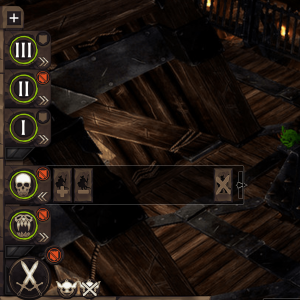
0.7.0 will also see significant overhauls to the unit grouping mechanic, now known as Warbands. Firstly the UI is being moved to the left hand side of the screen, this will put them in easy reach when you’re working rooms, spells and minimap at the bottom of the screen.
The Warband UI itself will be receiving a complete redesign that will make it much more versatile and friendly to use. While custom warbands can still be created you can now see what is in each group at a simple click as well as add units from the unit tab.
In addition context sensitive Warbands are automatically created for beasts, ember demons and wraiths, such Warbands only appear in this UI when the player owns the appropriate units.
Veins of Evil Visual Update
The veins are perhaps the single-most core mechanic within the game. Simply put if you want to do anything you have to use the veins at some point.
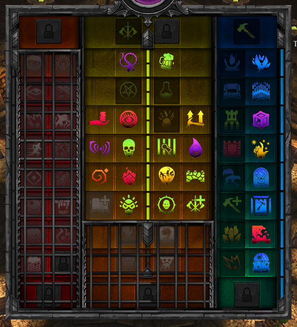
One of the most major problems with the current veins interface is that it can’t reflect the mechanics behind unlocking additional aspects. Our new veins UI, seen below, will provide additional feedback to the user showing how each aspect unlocked literally fills the veins and unlocks further tiers.
We’ve also colour coded it by vein and overall the veins now appear more practical and prettier.
Campaign Preview
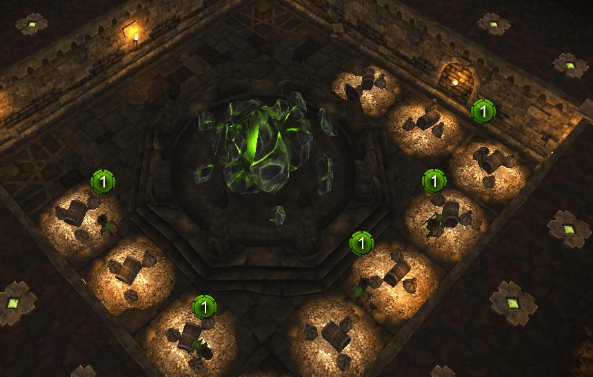
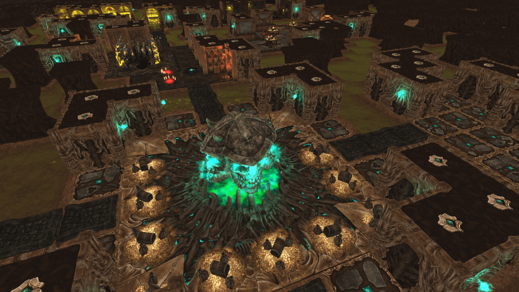
As promised in last week’s WFTO Wednesday we’ll be continuing to tease screenshots from other campaign levels. This week’s shows the dungeon of another as yet unrevealed Underlord, whether he’s a friend or foe is yet unknown, but one thing’s for sure, he sure has a taste for bones.
Livestream this Saturday! (January 24th @ 10PM UTC)
As a reminder, we’ll be hosting a livestream over on our Twitch channel this Saturday, to show off some of the content from the upcoming patch and answering any of your questions regarding it. Be sure to drop by with your questions, or just to listen in as we’re always a little more forthcoming with information when our faces are on screen!
Don’t forget to stop by next week for more news as we drive headlong towards release!
Until next time Underlord,
– WFTO Team




UI – Looks horrible shade of gray.
Rituals on the bottom – Great!
Top bar – gray?
Unit shields look great but don’t like the green on the outside and inside.
Warbands – Awesome!
VoE UI is still a mess if not worse now, its just horrible to look at all the icons just blend into a mess of color and shapes.
1
the gray is bad. warbands look cool and the vains i hate
Nice to see WFTO coming together, particularly the Skirmish mode of which I will spend many hours.
I agree with the other comments but when are we going have audio updates? as someone who is keen on game development and getting my masters in we still missing sound from all units, abilities and rooms AND YOU GOT ONE MONTH UNTILL RELEASE! the game is clearly not finished
Woh no sound?!
We have plenty of sound assets ready and awaiting implementation, we’re going to be making a big push on those this month. Fear not they’ll all be in before release. 🙂
Agreed the Veins are still pretty confusing especially for someone who is colorblind
Veins is a complete mess indeed. It reminds me of a game where it had 100 branches.
Im with the others. I have been following this from ks and it feels a mess now which is a great shame. we missing loads of stuff and its just going flop 🙁 🙁
All the greyscale elements are missing the color guys. The metal bits will get one color scheme,and the stone bits another.
One of the possible colors for them is that one you can see in the warbands picture. You can see a bit of the minimap frame under the warbands panel, colored with a brownish shade.
So we’re getting shown wip of wip of wip?
lots of negative comments here but I agree with them all. No sound makes the game empoty, runs really bad combat feels really bad.
Someone even pointed this out on there forum but all the fan bois came out and even the CEO!! Yes the ceo never addressed it saying “wait and see” its honestly not looking good
I feel sorry for the wfto developers. So many naggers. ¬_¬
Ooooh, goodies!
vains of evil is like a gay pride event right now and yeah it clearly showing its getting rushed.
I went back to 6months ago and no updates on audio. I just really hope they fix the fps issue..
hey guys? I cant get multilayer to work? non of my friends can.
All you crybabies: the devs say it’s going to be ok so calm your tits and wait until release. If shit’s still broken then you can complain.
These comments.. yes there are multiply issues and im starting to lose faith a little but we will see.
Guys I know combat is broken right but they said combat was getting a revamp months ago so don’t worry
We’re still working on combat, there’ll be some improvements coming in 0.7.0 🙂
I, for one, really like the new UI, Unit Shields and VoE Screen.
Everything in this Update looks awesome to me.
If we get some unit/room audio and a FPS patch until release I think this will be an totaly awesome game.
Dear devs, please keep up the great work!
All the forum fan boys have come out. There are some real issues that need fixing and putting into the game. This has not been done for multiply patches and with one month for the release people are getting upset.
– Why do we have to port forward to play multiplayer? I have not had to do this for years.
You don’t. If your router is up to standard, it will work on its own.
You give an update on UI elements and still ignore key-binding and hotkeys, which should be part of the game’s core mechanics and priorities, and at that, a month before release?
“Pragmatically minded Underlords will appreciate the need for a solid and cohesive UI that will permit them the greatest levels of control..”
What a joke.
Nice. However i have a question: do you plan to make more creatures for us. I meant more evil beasts, minions, undeads, etc. ?
All underlord units, aside from the super units, are already in the game. It is possible that we introduce new creatures in DLC after release, but there are no current plans for that.
Ahh, looking more improved. I think I rather sit out and wait for the final version so I can save bandwidth and time rather than update to 0.7.0
Anyway, the unit shield, or should I call it the Life Flower as I remembered since DK2. It’s kind of thin as I remembered, but DK2’s is thicker, easier to see. But DK1’s life flower is even better, 8 petals means our minions can be monitored a lot closely before their death and also can fight a little “longer” compare to only 6. But still, DK1’s unit shield is even prettier though….I’m just saying.
Guys please give us a patch or something like all the other comments have said the game is clearly not ready yet. You keep saying a,b,c is done.. well please show us.
Guys…CHILLAX and heres why…
1. Dungeon Keeper 3 is coming. BE HAPPY IT IS!..err war for the overworld
2. ummm DUNGEON KEEPER 3 IS COMING need I say again?!
3. let the team work! is it released? no. is it finished? no. should you complain about a product that isnt finished? Hell No!
4. We are promised updates after release, maybe mod support.
let em work…let em do their job to bring us DK3
Why did DK 1 do so much better thank DK2?
1. Voice
2. Attention to Detail
3. Evil presentation
4. Balance
5. Unique
6. Sound
Copy the formula!
I think every change you have made in this update has really added to the game, loving the new layout and colour scheme on the veins of evil, much better with the rituals at the bottom, the grey colour i’m impartial, i can see its benefit though
Is 1 month really enough time? I don’t want this rushed. Also, is War for The Overworld going to be highly moddable as was originally promised? IS the WfTO Nexus still going to be a thing?
High modability was scrapped quite a while ago (over a year ago infact) because it was slowing down develpment to the point that keeping it would have caused the game to not be released at all. It wwas either mod support, or the game I’m afraid. However, The devs said it is quite possible for a map editor to come to the game, though I’m not sure that is planned to come on release.
That is supremely disappointing. The thing with modability is that it ensures the games survival and re playability almost indefinitely. People are still playing The Elder Scrolls III: Morrowind to this day because it is moddable.
I was really looking forward to new monsters and dungeon themes being modded it.
I realy like the new desings, except for the Warbands, but they’re saying it’s getting a overhaul, and i thing truning the monster panel from gray to a not too bright yellow would help.
But overall i’m satisfied.
“All of the ports required to host a server are not open.” I don’t do this! As I proced to solve this problem? Please, help!
Grey is one of my favourite colours and I like it as it is… not such a big fan of the bright colours in VoE but I’ll eventually get used to it. All in all looks very good 🙂
I know that people get frustrated seeing negative comments, and it’s not something that devs like to see.
However, the success of a game depends hugely on the initial reviews, and meta-critic scores make or break games. It is imperative therefore that the game is in the best possible state before release.
I would urge the developers to delay release for at least an additional month, to ensure there is time to really polish it. This is a kickstarter project so you should not be rushing release at the whims of third parties. ‘Squeezing stuff in’ in the last couple of weeks is the hallmark of many ruined games (Sword of the Stars II, Elemental, Legends of Pegasus, Stronghold III. Rome II was awful on release but carried by the reputation of the studio/series).
Also the veins of evil screen needs to be re-designed, it is instantly disorientating, and honestly something of an eye-sore.
Meta-critic is overrated!
Unfortunately a significant number of people make purchase decisions based on meta-critic scores. For the game to be successful for players, it needs to be successful for developers (financially) as a basis and impetus to keep investing in it into the future.
Sadly that side of things can’t be ignored. That’s not to say that the devs will stop supporting the game if it doesn’t score well (I’m sure they will continue), but it badly damages any long term future.
That’s a sad truth. People should take more time to make their own opinion instead of using other opinions. Nonetheless do I know more people who just read online-gaming-magazins instead of looking at meta-critics.
Gaming turns too much into an industry.