 Pretty Things
Hey folks, A punishing and endless wind howls up from the abyss of our dungeon to raise an unholy vortex of bone dust and shattered dreams that screams across our bodies, leaving our skin shredded and our minds simultaneously shattered and torn… from this twisted wreckage emerges a hulking beast… the final iteration of the Augre. Ahem. This week we’re happy to unveil a few reworks of concepts that had some criticisms, let us know how we did this time and don’t forget to join us for our livestream!
Shiny Pretties & Re-Beautification
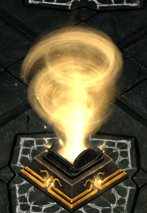
Gold Vortex: The Gold Vortex grew legs and sprinted down our art pipeline since we revealed it two weeks ago, huffing and puffing it launched its heavy frame into this news post because it was tired of units and rooms getting all of the glory.
Click to see the animated version
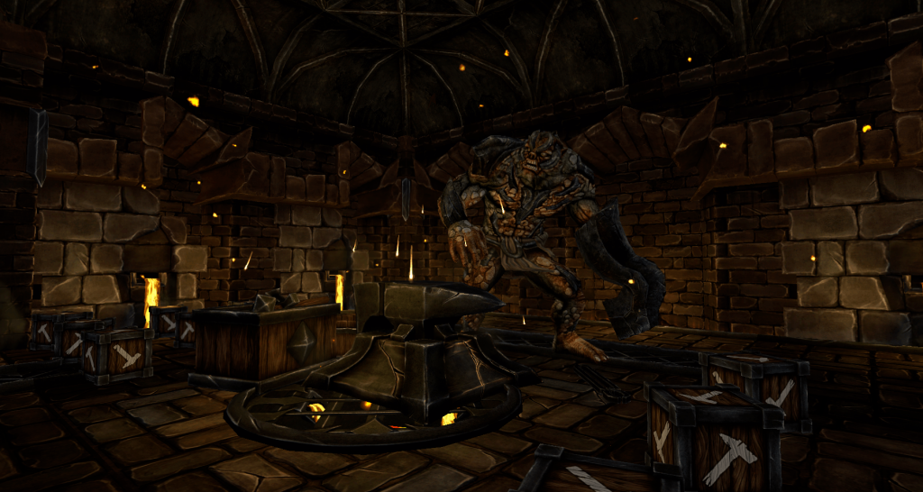
New, New Augre: We heard you didn’t like the Augre’s new arm… so we locked the lot of them up in the Foundry and gave them a few weeks to redesign the symbol of their people. The smell of burnt flesh and hair crept through the halls of our dungeon as hammers pounded endlessly against flesh, steel and bone. What emerged from the torrid room is awe-inspiring.
Please, please like it… our organic modeler has locked himself in a room and won’t come out until he knows that he’s done sculpting hammer arms.
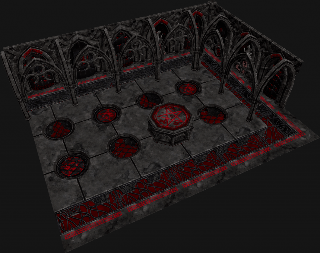
Sanctuary Floor: We’ve redesigned the Sanctuary floor to give this depraved sanctum an even more sinister look.
The Cultists who work the altar have since stopped complaining about having blood-soaked feet, apparently they take their hygiene very seriously while at work.
Livestream in 4 Hours! (June 4th @ 10PM UTC)
This livestream is sure to be one of our most exciting and interactive yet, make sure to set an alarm and join us on our Twitch channel later today. Hope to see you there!
Until next time Underlord,
– WFTO Team


Beatiulf
Looks awesome! I like the new Augre. And the new Sanctuary. And the new Gold Vortex. And…. oh that was it. Awesome work!
But really, i hope the Gold Vortex… uh… vortexes a bit slower in the final version. The animation seems very fast like that. Looks good though!
Looks good! didn’t like the original but this looks alot cooler. Referring to the monster ofc.
I like the new look of the Sanctuary. WIll it have a glow to it like the artwork?
On the trend of remoddeling, are there any plans for the treasure room? I find the tiles deviders (and the same treasure piles) make the room very repreatative.
Just fantastic! You folks are doing a bang-up job – couldn’t be happier with the progress!
how about multiplayer news?
Looks nice! But don’t let that designer out till he have redesigned the aweful Chunder. Please.
lol yeah lets not forget about that
Cool!
Looking forward to seeing that on OSX!
Too much time wasted on looks…get going with the game functionality instead. One that is done…only then work on the details…
At this rate the game won’t be released in 10 years.
Much better hammer arm. Think most people will be happy with this version.
I agree there was too much blood in the previous iteration, but The sanctuary looks way too clean now… At least add some blood spats and blood stains. Irrigation channels from the alter to the drains would look great and functional.
Further confirmation the sanctuary design is based on my Demonology Lab diagram. The old version even had some runes taken directly from my diagram. This pleases me, I had a tiny hand in something in a game I like. :3