Patch 2.1 “Deeper Darker Dungeons”
Release Notes
Darkest Greetings Underlord,
As promised a mere 11 days ago we have returned to this realm, dragging a surprise War for the Overworld patch kicking and screaming from the depths. This patch is a special one as it celebrates, somewhat belatedly, the 7th Anniversary of WFTO’s release and contains a few new features we, and you, might never have expected to see in WFTO.
But first an introduction. I’m Lee, one of the designers and the community manager at Brightrock. I’m better known in the community as Noontide. I’d like to take a moment to talk about the patch and why it’s a bit larger than our intended scope for maintenance.
A large part of this is a result of several months of on and off tinkering that I’ve been doing with the WFTO project. With input from my colleagues and assistance from the code team we’ve managed to wrap these changes up into this patch alongside the originally scheduled work and maintenance we had planned.
All of this is to say that this patch is meatier than first anticipated but also a little experimental and I would invite your opinions on changes that are being made here.
I expect this isn’t the last tinkering I will do with WFTO, but to set some reasonable expectations. I’m not a coder, I wasn’t involved in WFTO’s production directly and I’m still getting to grips with the project and its intricacies. A fair chunk of the work here involved a lot of help from others on the team who similarly supported me out of love and passion for the game.
So please understand that the inclusion of some unexpected features doesn’t change our intended plans for WFTO’s maintenance cycle. Which remains primarily an exercise in keeping a wary eye out for serious issues and addressing them with short bursts of activity between our work on Project: Aftercare.
With all that said I hope that you will enjoy the changes included in Patch 2.1 and you’ll keep an eye out for further news on Project: Aftercare this year 🙂
Now onto the patch notes!
Patch Highlights
Real-Time Shadow Support
One of my deepest desires for many years has been to see the game with real-time shadows, the light from torches casting long shadows of workers passing through, structures casting equally imposing presence on the environment. Ideal for dark, gritty dungeons.
There’s very real reasons why we never touched this. Frankly it’s super expensive performance wise, WFTO has a lot of dynamic lights already and each light is an expense, doubly so if they cast shadows. Then as time went on and performance generally improved, working backwards to introduce this was a non-starter because so much of the game had been done without it intended, as an example many objects that should have cast shadows, simply didn’t because they weren’t set up to.
Anyway a lot of that work has been a focus of my efforts, and now this is now a supported graphical feature. Largely I focussed on structures: Dungeon Cores, Shrines or significant light sources like the hand of evil. If you enable shadows this is the bare minimum you get.
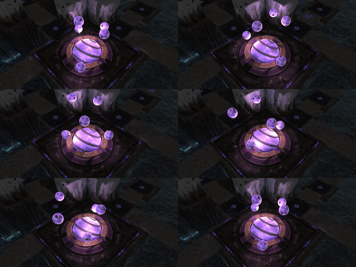
Some other shadow sources can also be optionally enabled, mostly this means corridor torches right now but may be expanded in the future to include room props and more if there’s enough performance headroom.
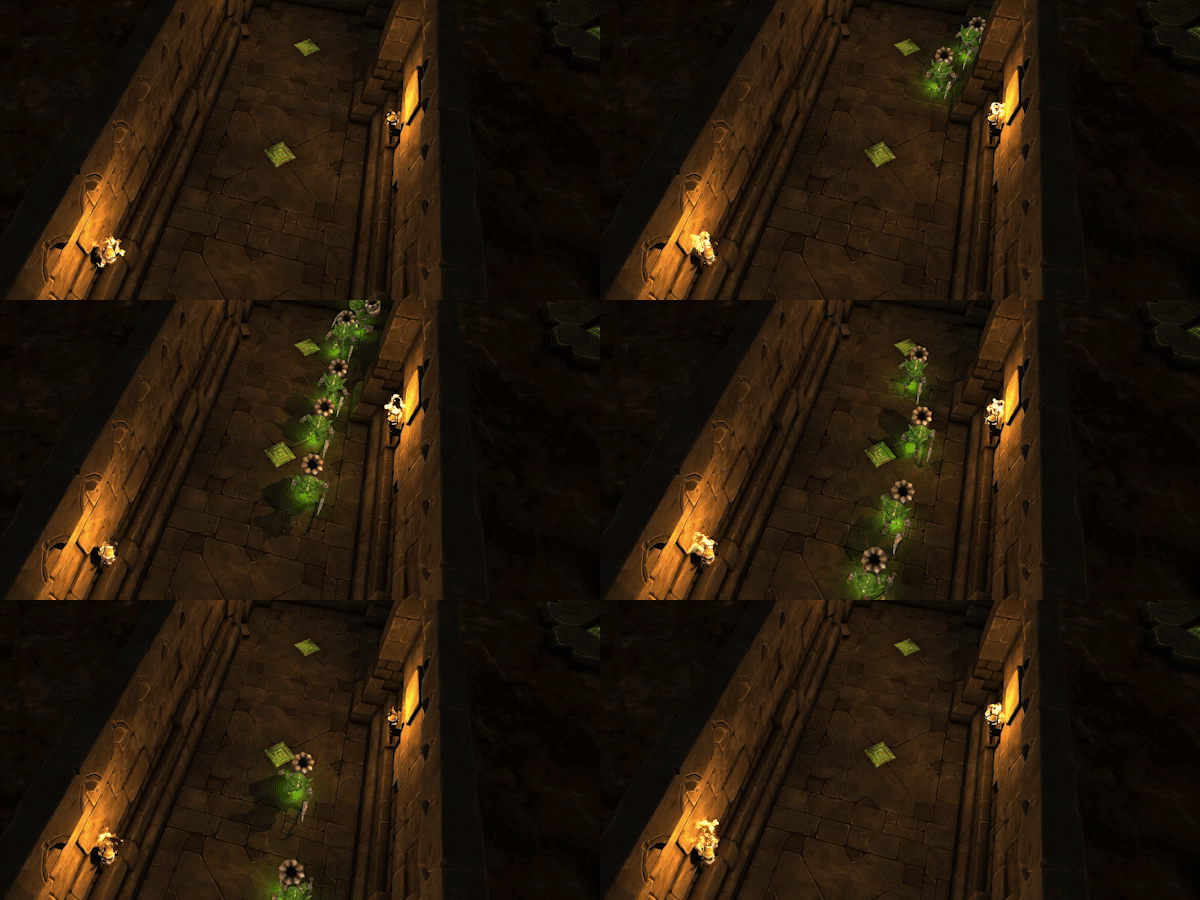
Speaking of performance, it should be expected that this is a net-loss in performance if you enable this. I’ve provided options to help offset this and the recommended finds a nice middleground. But you can totally kill your FPS if you want to get the best looking picture, I just wouldn’t recommend it for moment to moment gameplay.
Visual Tone Overhaul
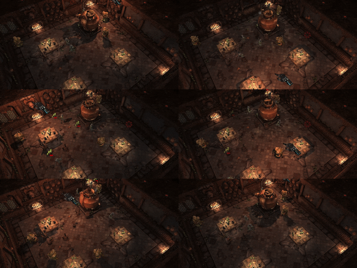
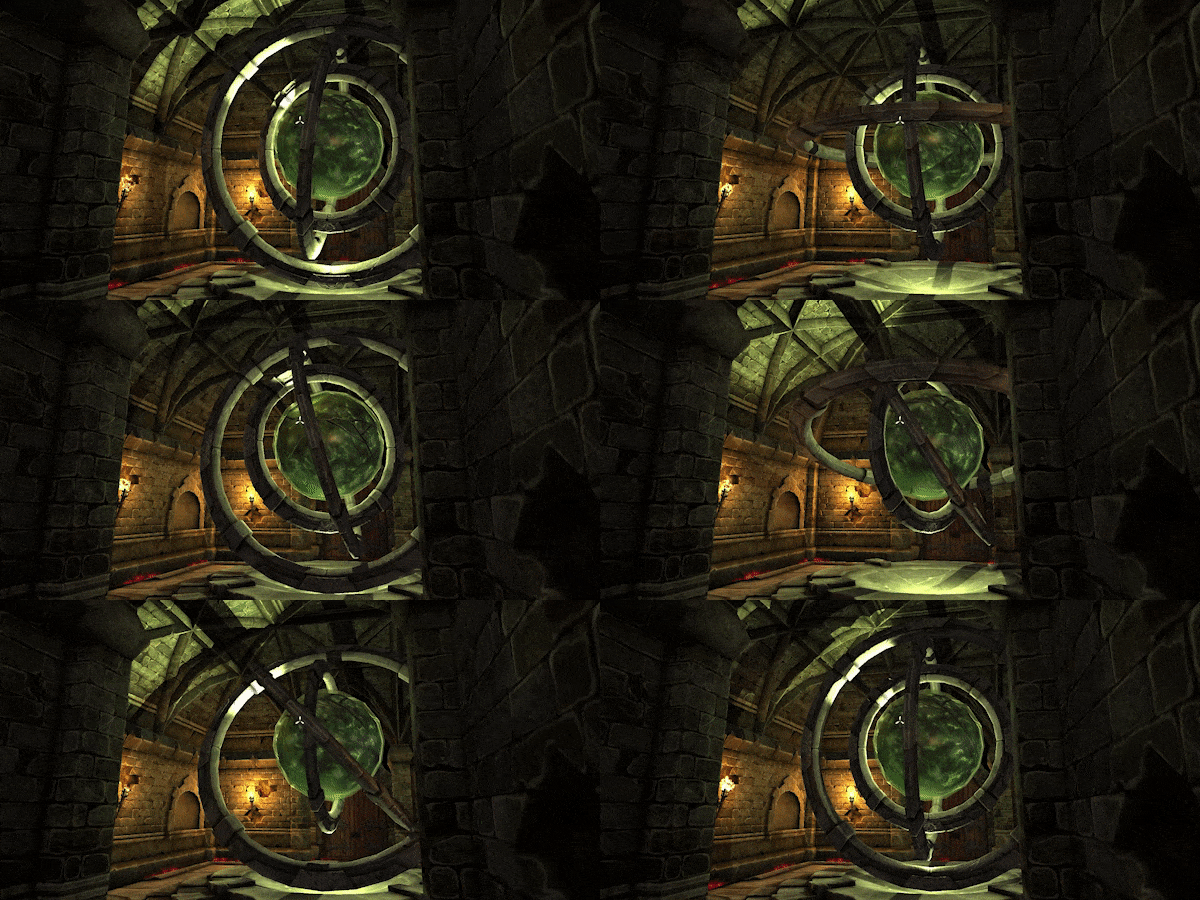
Part of my goals with my tinkering was to try and give the game a “deeper” atmosphere with an emphasis on feeling the effects of the terrain that surrounds you. First and foremost I wanted to communicate the sense that the player was underground with more oppressive shadows and lighting, whilst still allowing the player to see what they’re doing.
It’s hard to communicate these changes so here’s a few comparison screenshots.


Power Hand of Evil
Just over a year ago now we asked our Discord community whether they wanted to see the Power Hand of Evil, which was that year’s April Fools, make its way to the game. To say that the response was a resounding yes would be an understatement. So we finally got around to doing that.
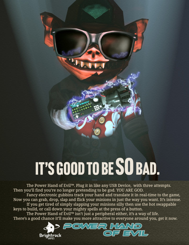
The Power Hand can be access via the gameplay options menu.
UI Performance Optimisations
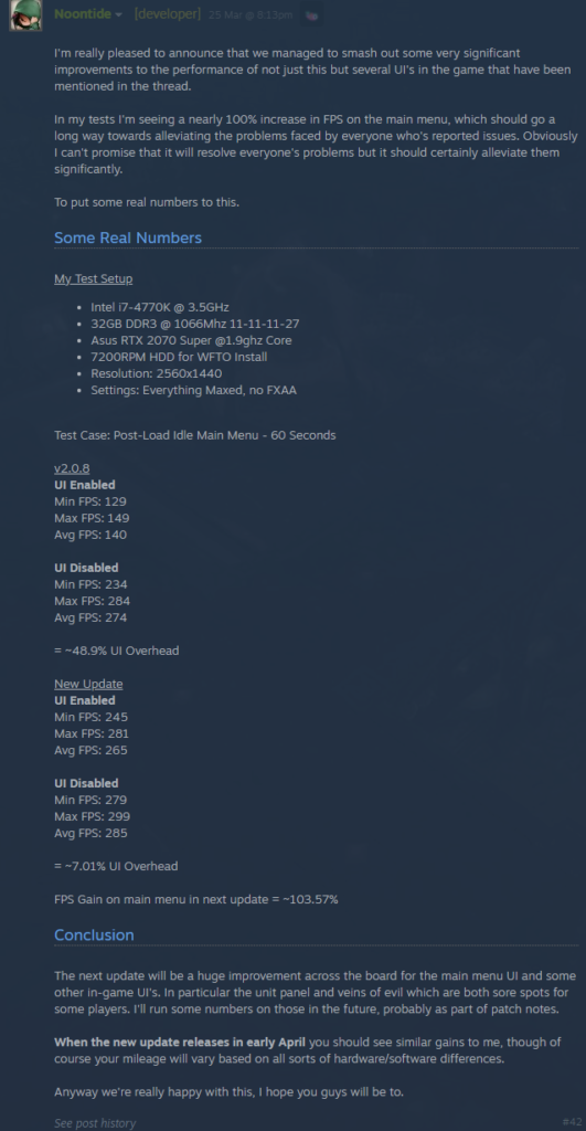
Thanks to feedback from the community we managed to isolate a few significant performance monsters in the UI. This should greatly improve the performance of the Main Menu but also parts of the in-game UI that are known to cause problems such as the units panel and veins of evil.
In some brief logging I confirmed a significant 41.8% reduction in UI overhead on the main menu in a steam thread:
Gains for the In-Game UI are more circumstantial but the unit panel in particular is much, much faster taking only 0.1ms to render down from 5ms when fully populated and in advanced mode. That’s a massive 5000% gain in performance!
Visual Changes
Dynamic Shadows
- Dynamic Shadows can now be enabled in the options menu with various configurations
- Shadows can be enabled or disabled and configured to be cast only by important lights or specified optional lights
- The distance at which shadows are rendered is set by the Shadow Distance setting
- The resolution of shadows is affected by the Shadow Resolution setting
Tonal Updates
- The Hand of Evil now casts a larger light which is colour toned based on the terrain theme
- Players can override the colour of this light via a new setting in the options menu
- The game’s default lighting is now darker in tone and with a very slight orange hue
- Increased the intensity of SSAO
- Explored fog of war is now tinted based on the terrain theme, it’s cold out there amongst the ice
Dungeon Themes
- Rhaskos Dungeon Theme
- Improved visuals on the Dungeon Core, fixed a few errors and introduced new elements to spruce up the granddaddy of all cores
- Improvements to the Rhaksos wall topper
- Arcane Dungeon Theme
- Dungeon Core now has a visible ebb in its visual effects
- All Dungeon Cores and walls have had a lighting pass in support of visual tone changes and shadow support
Shrines, Structures and Environments
- All Shrines & Structures (such as gateways) have had a lighting overhaul to make best use of the new shadow system
- Artefacts of all types cast slightly more light
- The Underworld Gateway now fully team colors to your faction’s colour
Terrain
- Gold now has a glittering effect in all themes, this is adjusted based on the terrain theme
- Ice theme terrain now has a reflective component, making it look a little more icey
Units
- Workers now have a small team coloured light to help identify them amongst the crowds
- Oni Ashigaru Worker – Reduced Brightness, more consistent with other skins
- Survival workers now have a more consistent brightness with other workers
- Easter worker no longer dyes his fur to suit your team colour, animal cruelty is ended
- The Cynical Imp no longer changes his skin color, instead he just picks different colors to emphasize his suit
Miscellaneous Changes
- Dramatically improved loading times for the custom campaign menu and other menus where many levels are loaded sequentially
- The War for the Overworld launcher is deprecated and has been removed.
- Loading screens now feature the War for the Overworld logo without patch banners.
Performance Optimisations
- Significant improvements to the Main Menu UI will deliver up to 100% improved performance on the Main Menu
- Significant improvements to several in-game UIs including but not limited to:
- The Veins of Evil
- Units Tab
- Potions Tab
- Groups UI
UI & Interface
- Controller input for possession can now be disabled in the options menu
Bug Fixes
Crashes & Gamebreakers
- Fixed an issue which would cause the game to enter a softlock state on loading transition in and out of levels
Visual Issues
- Fixed an issue which prevented a specific arcane theme floor from being teamcoloured
- The Cynical Imp is now appropriately teamcoloured
- Fixed an issue where the worker claim vfx would not persist long enough in some tasks
- Quartz now appears correctly in all terrain themes
- The Team Indicator for perception shrines no longer hides underground
Audio Issues
- Fixed an issue where the Rhaskos core heartbeat would not play in sync with the animation
Levels / Campaigns
- War for the Overworld – Level 1 – Fixed an issue where the edge highlighter for tiles in the tutorial would not display correctly
- War for the Overworld – Level 9 – Enemy units in the arena now count towards objective completion.
UI
- The description for the frostyweaver unit has been updated to correctly reflect its passive abilities
- Fixed stick drift causing the possession camera to turn permanently if the player has an analog input device plugged in
- If the UI fails to load it will no longer default to google.com, therefore removing your ability to google the issue immediately
- Fixed an issue that would cause part of the unit panel to become inaccessible after losing a unit at certain UI scales
- The unit panel should now behave properly at all normal UI scales… probably.
Map Editor
- Fixed an issue that could cause a dungeon core to become deserialized, making it untargetable and unremovable in the map editor. Killing your map.
Mighty Script
- Patrols added via the spawn party action should now behave as intended.
Multiplayer
- Fixed an issue where users on the GOG platform and Steam platform could not see each other’s multiplayer games#
GOG Version
- Custom campaigns will now be unpacked outside of GOG’s cloud save area, preventing an overload of your cloud save capacity
Cheers,
– Brightrock Games Team
Click here to discuss this update on our forums
Click here to chat about this update on our Discord
Never miss an update! Sign up to our newsletter!
